Major thank you's:
- Phil Caridi
- Jeff Feddersen
- Blair Simmons
- Leia Chang
midterm
For the midterm, I decided to continue my Clock project. And after going back and forth on the form and how to get three different clock hands rotating and dripping three different inks in real life, I decided (after great feedback from Blair Simmons) to simplify and concentrate on just one aspect: my menstruation cycle (our natural, biological time) vs. the calendar (man-made construct of time).
It was very freeing to only have to worry about one metaphor, and I took great inspiration from Jay Griffith's A Sideways Look at Time. Some particularly interesting (cutting?) quotations from her book:
The moon swells to full, then a moon-shedding begins, ebbing itself to a crescent; the moon, symbol of women, fluctuates, alters, changes, flows in cycles. (Though a patriarchy would privilege the changelessness—of the sun—over the inconstancy of the moon and you.)
— A Sideways Look at Time, 134
The much-maligned paramenstruum (defined as the two days before a period and the first two days of it) floods you with insight, with surges of instinctual thought, with demanding intensity, with burning innerness, thinking at full feeling. It is a time when the world full tilts towards you.
— A Sideways Look at Time, 141
If the paramenstruum is respected, it is a time of exceptional power, but if suppressed it will become a punishment, a curse...There is a veering difference now between the woman's interior, idiosyncratic, private clock and the exterior public clock with its strict, regular beat...Trying to fit her inner calendar to the male calendar causes a woman's snarling premenstrual feeling to increase...Jung suggested women should have the first three days of their periods off work to escape the masculine time rhythms of work.
— A Sideways Look at Time, 143–145
Women are never one [self], they are at least two.
— A Sidways Look at Time, 144
I decided to really concentrate on:
- the relationship between the moon and the menstruation cycle (which I already explored in my sundial project, so it was nice to also reuse that)
- the inner calendar of the menstruation cycle not fitting neatly into the 28–31 day work calendar
I came up with a few designs and cardboard prototypes to ask what people thought of the clock face design and form. I also prototyped the inside layout:
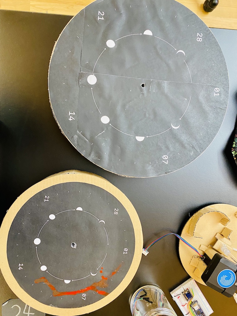
So the idea was that red ink would drip onto the calendar, so that over the course of a year's worth of menstrual data all the numbers would be covered and only the red ink relative to the lunar phases would remain.
It was great to do the prototypes, because Jeff and Gracy caught an error in the design right away: that the lunar phase and dates of the months don't usually align. At first I thought it'd be ok to go forward, and incorporate it into the design as a purposeful undermining of the calendar, but the more I thought about it the more disatisfied I got.
final
In trying to reason out the discrepancy between lunar phases and the calendar, I remembered what Pedro suggested that I expand beyond the circle and also experiment with a linear form.
And that's when some more concepts came together:
- I want the lunar phase to have a circular rotation, it loops
- I want the calendar to have a linear motion, it ticks forward until it reaches the end of the month and snaps back (like a typewriter)
- I want my menstrual cycle (the tube that drips red ink) to be stationary (as opposed to the previous iteration where it was the only thing that moved). I liked the idea of placing myself at the "center", that—as Griffiths wrote, "the world full tilts towards you"—and I am static as everything moves around me.
To test this idea in the quickest way possible, I printed out some designs, cut them out, and showed them to a few people:
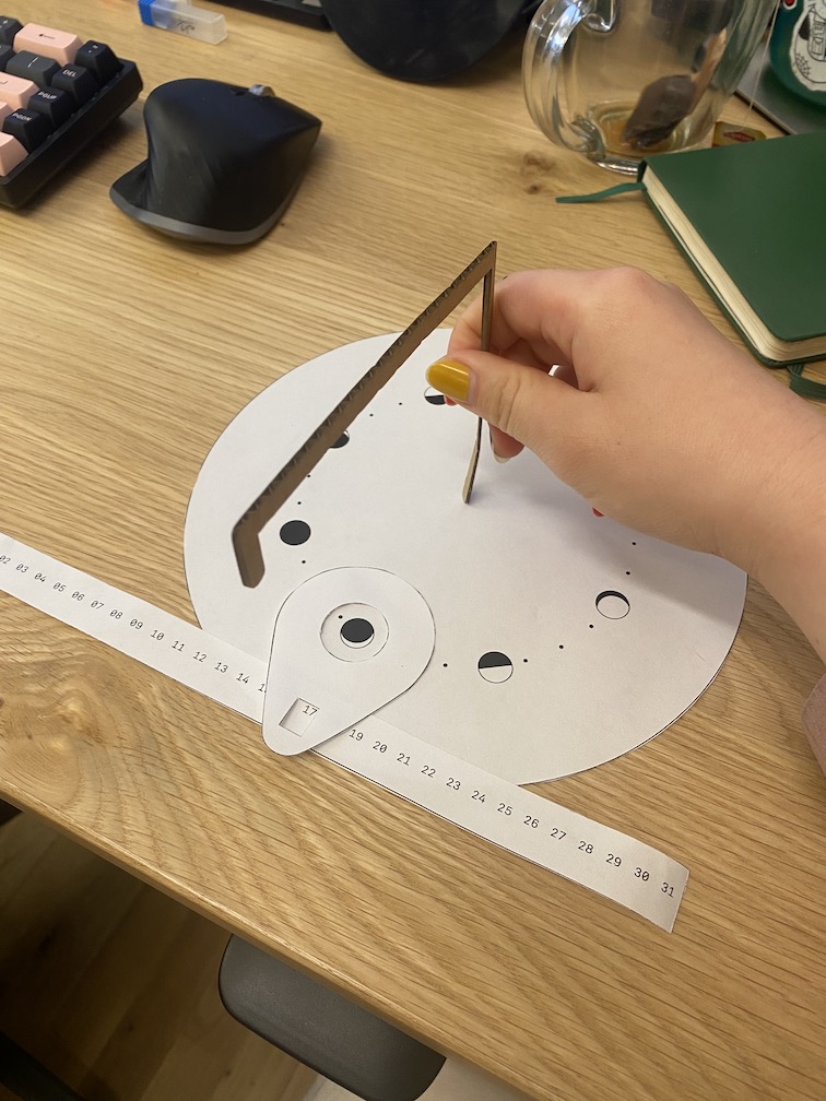
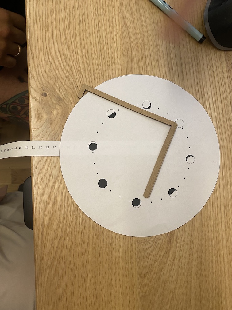
The left photo is my original idea of this iteration, and I also created a few mockups for Phil's suggestion of what if the red ink drips through the calendar (passing it by because it is an imaginary construct) and lands on the lunar phase instead? It was a fascinating idea that highlighted the realness of my menstrual cycle and the realness of the moon, and subverted the manmade calendar. I liked the idea a lot, but it didn't quite capture the linearity I wanted, and it also seemed to not resonate as much when I asked around (though perhaps I unconsciously biased them?).
The most immediate feedback I got was that the typewriter-like linear movement of the calendar was extremely disatisfying. Almost everyone wanted it to rotate. Iterating on that idea, Leia gave a fascinating idea of, what if the calendar is extended to all 365 days instead of just the 31 days of a month, and as the clock moves through the days they fall and pool on the floor?
Phil helped me iterate on that receipt idea, and suggested the right photo, where the calendar comes out of the body of the clock so that it'd all look like it belonged to one piece, and also to allude that the days that are coming are in the future and we can't see them.
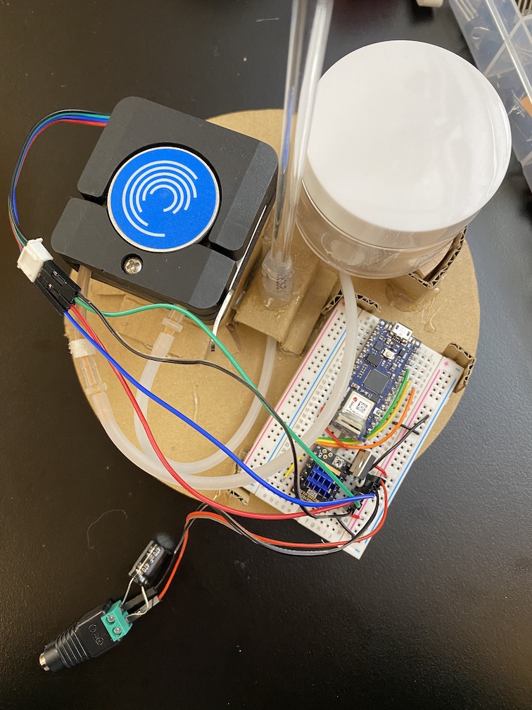
I've been stuck between these two ideas, so I've decided to put the overall form design on hold and work on finalizing the pump instead.